
Your website is your digital storefront, but if it isn’t optimized for the palm of a hand, you’re essentially leaving your front door locked.
With more than half of all global internet traffic originating from smartphones, designing with a desktop-centric mindset is no longer viable. Search engines have evolved far beyond standard indexing; we now live in an era dominated by mobile-first web design, artificial intelligence, and personalized answer engines.
If your digital presence isn’t built from the ground up for handheld devices, you are actively losing visibility, traffic, and revenue. Let’s dive into how you can master this fundamental framework to build a high-performance website that satisfies both human users and advanced search algorithms.
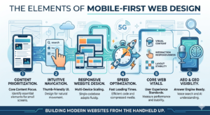
Why Mobile-First Web Design Dictates Modern SEO
For years, the standard approach to building websites was simple: design a beautiful desktop layout, and then figure out how to shrink it down for smaller screens. This approach is officially dead.
When Google fully transitioned to mobile-first indexing, the desktop version of your site became secondary. The search engine’s bots now crawl and evaluate your content based primarily on how it renders and performs on a smartphone.
If your mobile layout lacks crucial text, has broken elements, or hides important data, your entire digital footprint suffers. This shift requires a radical change in strategy. You must treat mobile screens as your primary canvas, ensuring that every asset, piece of text, and interactive element functions seamlessly on a compact display before scaling upward.
The Strategic Difference Between Adaptations
When looking to optimize your digital presence, you will likely encounter three distinct terms that sound similar but operate very differently under the hood:
- Mobile-First Web Design: An architectural philosophy where you start building for the smallest screen size first (like a smartphone) and progressively add features, complex layouts, and visual elements as the screen real estate expands (to tablets, laptops, and ultra-wide monitors).
- Responsive Website Design: A fluid technical implementation where a single codebase uses CSS media queries to automatically resize, hide, shrink, or move content to fit whatever screen size the visitor happens to be using.
- Mobile Optimization: A broad, overarching practice that ensures your mobile visitors have an exceptional experience. This includes fine-tuning server speeds, optimizing touch targets, restructuring text readability, and streamlining checkout forms.
By executing a proper mobile-first web design strategy, you inherently leverage responsive website design and mobile optimization as the core building blocks of your development lifecycle.
Core Visual Mechanics: Layouts That Convert
Designing for smaller screens requires extreme visual discipline. You don’t have the luxury of multi-column sidebars, massive background videos, or sprawling navigation menus. Every single pixel must serve a definitive purpose.
The Power of Single-Column Fluid Layouts
Forget multi-column grids when planning your initial interface. A smartphone screen is a narrow, vertical container. Your content should flow down a single, intuitive vertical column. Use percentage-based fluid grids instead of fixed pixel widths. This ensures that whether a user has an older compact smartphone or the latest flagship pro model, the layout adapts smoothly without horizontal scrolling.
Typography and High-Contrast Readability
If a user has to pinch-to-zoom to read your text, they will leave your site immediately. Maintain a minimum base body font size of 16px. Stick to clean, legible sans-serif fonts that render crisp lines on low-resolution displays. Furthermore, pay close attention to line height (aim for 1.5) and paragraph spacing to give your text room to breathe, preventing blocks of text from turning into overwhelming walls of prose.
Thumb-Zone Accessibility
Hold your phone naturally with one hand. Where does your thumb comfortably rest? It lands in the lower and middle thirds of the screen.
Keep your primary call-to-action (CTA) buttons, navigation icons, and interactive elements within this “Thumb Zone.” Avoid placing critical navigation links at the absolute top corners of the screen, where users have to strain or use two hands to tap them.
Technical Performance: Speed, Core Web Vitals, and Core Architecture
A beautiful mobile layout is completely useless if it takes ten seconds to load. Mobile users are often on the move, dealing with spotty 4G or 5G networks, constrained data plans, and varied device processing speeds. Speed isn’t just a convenience factor; it is a critical ranking signal.
To pass Google’s Core Web Vitals assessment, your technical framework must be highly efficient:
| Metric | Full Form | Target Threshold | What It Measures |
| LCP | Largest Contentful Paint | Under 2.5 seconds | Visual loading speed (when the main content renders) |
| INP | Interaction to Next Paint | Under 200 milliseconds | Visual responsiveness to user inputs (clicks, taps) |
| CLS | Cumulative Layout Shift | Less than 0.1 | Visual stability (preventing elements from jumping around) |
Advanced Media Compression
Images are almost always the biggest culprit behind slow loading times. Stop uploading raw PNGs or massive JPEGs. Shift entirely to next-generation image formats like WebP or AVIF, which offer superior compression with virtually zero quality loss.
Implement responsive image syntax (srcset) so the browser knows to fetch a smaller, lightweight image asset for a mobile device instead of downloading a massive desktop-sized graphic.
Aggressive Code Optimization
Clean up your codebase. Minify your HTML, CSS, and JavaScript files by stripping out unnecessary spaces, comments, and formatting. Eliminate render-blocking resources by deferring non-essential JavaScript until after the visual layout has loaded. Leverage robust browser caching strategies and route your traffic through a reliable Content Delivery Network (CDN) to serve assets from servers physically closest to your visitor.
Optimizing for AEO and GEO: The Next Frontier of Discovery
Traditional search engine optimization is rapidly shifting. While ranking on the traditional Google desktop Search Engine Results Page (SERP) remains vital, you must now simultaneously optimize for Answer Engine Optimization (AEO) and Generative Engine Optimization (GEO).
Tools like Gemini, ChatGPT, Perplexity, and Google’s AI Overviews change how mobile users consume information. Instead of browsing a list of blue links, users receive a singular, synthesized response to their direct questions.
Because AI-driven engines pull their answers directly from high-quality web content, your foundational mobile-first web design strategy must accommodate how these modern systems read, parse, and evaluate your data:
- Structure Data with Clear Schema Markup: Implement robust, explicit structured data (JSON-LD) across your entire architecture. This provides explicit clues about the meaning of your content to search engines, making it incredibly easy for AI engines to extract your data for rich snippets and conversational answers.
- Write for Conversational Voice Intent: Mobile users frequently use voice search via Google Assistant, Siri, or ambient audio tools. People don’t type keywords like “mobile-first web design tips SEO” when speaking; they ask full questions like, “How do I make my website load faster on a smartphone?” Mirror this natural phrasing throughout your headings and body paragraphs.
- Create Clear Informational Clusters: Keep your content organized into scannable, deeply informative sections. Use clear, descriptive headers (## and ###), structured bullet points, and concise summary blocks. When an AI crawler parses your page, well-structured sections allow it to easily extract precise fragments to answer highly specific user queries.
Common Mobile Pitfalls to Avoid
Even seasoned developers make mistakes that can tank a site’s mobile performance. Keep an eye out for these frequent issues:
- Intrusive Pop-ups and Interstitials: Nothing ruins a mobile browsing session faster than an unclosable pop-up advertisement that takes up the entire viewport. Google actively penalizes sites that block content accessibility with aggressive marketing overlays. If you must use pop-ups, ensure they are small, easy to dismiss, and do not cover primary informational content.
- Tightly Packed Tap Targets: If your buttons or text links are placed too close together, users will accidentally tap the wrong link. This creates immediate frustration. Ensure all touch targets are at least 48×48 pixels in size, with plenty of negative space surrounding them.
- Unplayable Content and Legacy Formats: Avoid using outdated animations, complex scripts, or legacy media formats that aren’t natively supported by iOS or Android web browsers. Stick to modern web standards like HTML5, CSS3, and native browser APIs.
Actionable Checklist for Launching Your Project
To wrap things up, use this quick checklist before taking your next web design live:
- Test your layout on multiple physical screen sizes and mobile operating systems.
- Run your URLs through Google PageSpeed Insights and aim for a mobile performance score of 90+.
- Verify that your base font sizes are at least 16px with an open, easily legible line height.
- Ensure all interactive buttons have a minimum footprint of 48×48 pixels.
- Implement clean JSON-LD schema markup to assist AEO and GEO crawlers.
- Double-check that no critical content or navigation elements are hidden exclusively on the mobile view.
Frequently Asked Questions
What is the core difference between mobile-first web design and responsive website design?
Mobile-first web design is a strategic workflow where you prioritize and design the layout for mobile devices before scaling it up for larger viewports. Responsive website design is the actual code mechanism (like CSS media queries and fluid grids) that enables a single website layout to dynamically scale across multiple screens.
How does mobile optimization impact my overall SEO visibility?
Since Google exclusively utilizes mobile-first indexing, your mobile site serves as the baseline for how your website is crawled, evaluated, and ranked. If your mobile layout suffers from slow load times, poor visibility, or broken navigation, your rankings across both desktop and mobile search platforms will decline significantly.
Why are AEO and GEO critical for modern mobile search strategies?
Mobile users increasingly rely on voice search, quick interactions, and AI tools like Gemini or Perplexity to get immediate, synthesized answers on the go. Optimizing for Answer Engine Optimization (AEO) and Generative Engine Optimization (GEO) ensures your content is structured clearly enough for AI models to pull, quote, and cite your website as an authoritative source.
Can I just use a dedicated mobile subdomain (like m.example.com) instead?
While separate mobile URLs were common in the early days of the web, they are no longer recommended. They create duplicate content issues, double your management workload, and split your backlink equity. Implementing a unified responsive website design is the cleanest approach for both modern search engines and your development team.
How do I check if my website meets modern mobile usability standards?
You can use developer diagnostic tools like Google Lighthouse, PageSpeed Insights, and the layout inspection tools within your browser’s developer console. These platforms analyze your core web vitals, check element spacing, flag intrusive code, and offer actionable steps to improve your site’s mobile experience.
Conclusion
Shifting to a mobile-first web design framework is no longer just a trend or an optional optimization trick; it is the baseline requirement for surviving in today’s digital landscape. By changing your workflow to prioritize small screens first, you establish a lean, lightning-fast foundation that naturally scales upward into a flawless responsive website design.
Furthermore, this clean architectural approach ensures your content is perfectly primed for the future of search. Whether an algorithm is auditing your Core Web Vitals for traditional Google indexing, or an advanced AI engine is parsing your data for mobile optimization and AEO/GEO discovery, a mobile-first framework ensures you remain visible.
Stop viewing mobile as a secondary target. Build your web experiences from the handheld screen up, and watch your user engagement, search rankings, and conversion rates thrive.
Read our other articles:
Master Your Content Marketing Strategy: 2026 Guide
10 Web Development Mistakes Killing Your Traffic (Fixed)
Visual Branding Importance: Build a Memorable Identity